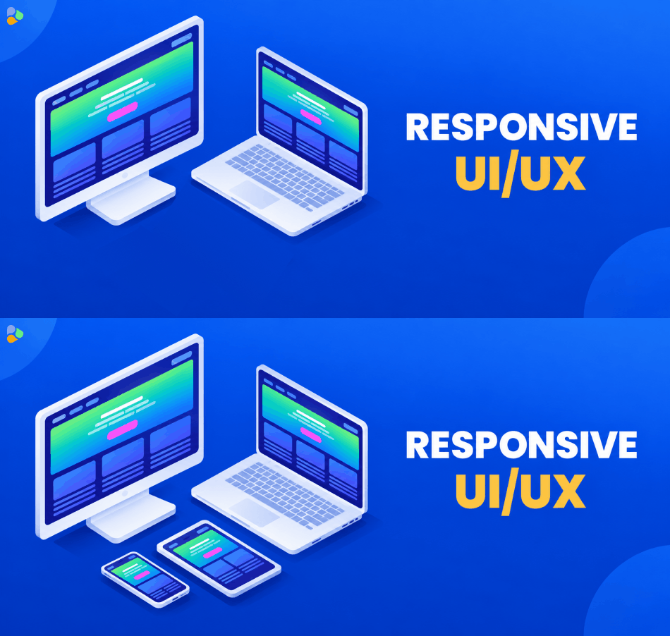
This makes responsive UI and UX design an important part of modern web and application development. A design that looks good on a large desktop screen may feel crowded on a mobile phone. Similarly, a mobile layout stretched onto a large screen can leave too much empty space and make the experience feel unfinished.
Responsive design solves this problem by allowing the interface to adapt to the available space. Instead of creating a separate design for every device, developers can use flexible layouts, responsive images, appropriate typography, and breakpoints that respond when the content needs to change.
What Is Responsive UI/UX Design?
Responsive design is an approach where a website or application adjusts its layout and content according to the screen or viewport available to the user.
For example, a desktop website might display three product cards in one row. On a tablet, those cards might move into two columns, while on a mobile phone they could appear as a single vertical list.
The goal is not simply to make everything smaller. A good responsive experience changes the layout, spacing, navigation, images, typography, and sometimes the way users interact with important features.
Responsive design is therefore closely connected with both UI and UX. UI focuses on how the interface looks, while UX focuses on how easily people can use it.
Why Responsive Design Matters
A website can have excellent content and attractive visuals, but users may leave if the interface is difficult to use on their device.
Common problems with a non-responsive website include:
- Text that is too small to read
- Buttons that are difficult to tap
- Images extending beyond the screen
- Horizontal scrolling
- Menus that are difficult to access
- Forms that are uncomfortable to complete
- Content that becomes crowded on smaller screens
- Excessive empty space on larger screens
Responsive design helps create a consistent experience across different devices while allowing the interface to adapt to the available space.
It also helps teams avoid designing for every individual phone, tablet, or desktop model. Modern responsive design works better when layouts adapt based on where the content starts to become difficult to use rather than targeting a long list of specific device dimensions.
1. Start With a Mobile First Approach
One practical approach to responsive design is to start with the smallest screen and then expand the experience for larger screens.
This is known as mobile first design.
On a small screen, there is limited space, so the designer has to decide which content and actions are most important. Once the core experience works well on mobile, additional columns, navigation options, visual elements, and spacing can be introduced as more screen space becomes available.
A mobile first approach does not mean that desktop design is less important. It simply encourages designers to prioritize essential content and functionality from the beginning.
2. Use Flexible Layouts
Avoid building layouts that depend too heavily on fixed widths.
A fixed-width design can look fine on one screen but create problems when the viewport becomes smaller. Content may overflow, columns may become too narrow, or users may have to scroll horizontally.
Flexible layout systems such as CSS Flexbox and CSS Grid make it easier to create layouts that adapt to different screen sizes. They allow elements to grow, shrink, wrap, and rearrange according to the available space.
For example, instead of telling a card to always be exactly 300 pixels wide, a responsive layout can allow the card to occupy an appropriate portion of its container while maintaining a sensible minimum size.
3. Choose Breakpoints Based on Content
Breakpoints determine when a layout changes.
A common mistake is to design specifically for a list of popular devices. There are too many screen sizes and orientations to maintain a separate breakpoint for every device.
Instead, look at the content.
If a navigation menu becomes crowded, that is a good point to change the navigation. If two columns become too narrow to read comfortably, they can become a single column.
This approach creates a more flexible design because the layout responds to the needs of the content rather than a particular phone or tablet model.
4. Make Typography Responsive
Text needs to remain readable across different screen sizes.
Large headings that look attractive on a desktop can take up most of a mobile screen. At the same time, very small text can make a desktop page difficult to read.
Responsive typography can adjust font sizes, line heights, and spacing according to the available space.
However, avoid making every font size depend entirely on viewport units. Text should remain accessible and readable, and users should still be able to zoom when necessary.
A good responsive design considers:
- Font size
- Line height
- Paragraph width
- Heading hierarchy
- Text spacing
- Button and link readability
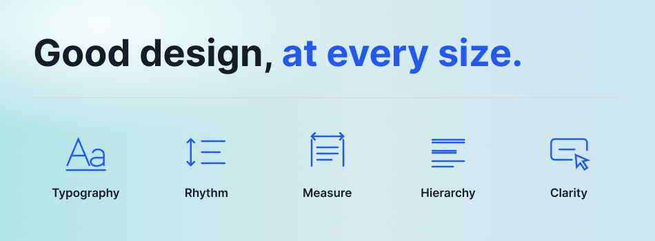
The goal is to make the content comfortable to read rather than simply making everything fit on the screen.
5. Optimize Images for Different Screens
Images are an important part of modern websites, but large images can affect both design and performance.
A large desktop image does not always need to be downloaded at the same size on a small mobile device. Responsive image techniques can help browsers use an appropriate image based on the available space and device characteristics.
Using technologies such as srcset, sizes, and the <picture> element can help deliver suitable image resources for different situations.
Images should also be compressed and displayed within their containers so they do not create unwanted horizontal scrolling.
Good image handling improves both the visual experience and the performance of the website.
6. Design Navigation for Smaller Screens
Navigation is one of the areas that usually needs the most attention in responsive design.
A desktop website may have enough space for a complete navigation bar with several links. That same navigation can become crowded on a mobile screen.
A mobile navigation menu can reduce the amount of space used while still giving users access to important pages.
However, a small menu icon is not enough by itself. The control should be easy to identify and operate using touch, and users should understand what happens when they open or close the menu. Mobile accessibility guidance also recommends paying attention to touch controls and keeping mobile interaction straightforward.
7. Make Buttons and Touch Controls Easy to Use
Desktop users commonly interact with a mouse or trackpad, while mobile users primarily use touch.
This difference matters when designing buttons, links, forms, menus, and other interactive elements.
Controls should have enough space around them so users can tap them without accidentally selecting another option.
Important actions should also be visually clear. Users should not have to guess whether an element is clickable.
When designing mobile interfaces, test important controls with actual touch interaction rather than only checking how they look on a desktop screen.
8. Keep Forms Simple on Mobile
Forms are often harder to use on small screens.
Typing on a phone takes more effort than typing on a desktop keyboard, so unnecessary fields can create friction.
When designing responsive forms:
- Ask only for information you actually need
- Use clear labels
- Use appropriate input types
- Keep fields easy to tap
- Make error messages easy to understand
- Avoid unnecessarily long forms
- Keep important actions visible
A responsive form should not only fit the screen. It should make completing the task comfortable.
9. Think About Orientation
Users can hold mobile devices in portrait or landscape orientation.
A layout that works well in portrait mode may behave differently when the device is rotated.
Important pages should therefore be tested in both orientations where relevant. Check navigation, images, forms, cards, tables, and other important components.
The goal is not necessarily to make every screen look identical in every orientation. The goal is to ensure that the experience remains usable.
10. Use the Viewport Meta Tag
For responsive websites, the viewport configuration is an important technical detail.
A common configuration is:
<meta name=”viewport” content=”width=device-width, initial-scale=1.0″>
This tells the browser to use the device width as the viewport width and helps responsive layouts behave as intended on mobile devices.
Without appropriate viewport handling, mobile browsers may render a page using a wider virtual viewport, which can interfere with responsive layouts and media queries.
11. Consider Accessibility From the Start
Responsive design and accessibility should work together.
A layout may technically fit on a mobile screen but still be difficult for some users to navigate.
Designers and developers should consider:
- Readable text
- Sufficient contrast
- Keyboard accessibility
- Screen reader support
- Clear focus states
- Accessible buttons and links
- Touch-friendly controls
- Forms with clear labels
- The ability to zoom content
Mobile users may also use built-in screen readers such as VoiceOver and TalkBack, so responsive interfaces should not focus only on visual appearance.
12. Avoid Hiding Important Content Just to Save Space
Responsive design sometimes involves moving or collapsing content, but important information should not disappear simply because the screen is smaller.
Before hiding an element, ask whether users need it to complete their task.
For example, a navigation menu can be collapsed, but important contact information or a primary action should still be easy to find.
Responsive design should simplify the interface without making important information difficult to access.
13. Test Across Real Screen Sizes
A design should not be considered responsive simply because it looks good in a desktop browser after resizing the window.
Testing should include different screen widths, orientations, browsers, and interaction methods.
Useful checks include:
- Small mobile screens
- Large mobile screens
- Tablets
- Laptops
- Large desktop monitors
- Portrait orientation
- Landscape orientation
- Touch interaction
- Keyboard navigation
Browser developer tools can help simulate different viewport sizes, but testing on real devices can reveal interaction and performance issues that a simulator may not fully reproduce.
14. Check Performance Along With Design
Responsive design is not only about layout.
A mobile user may have a slower connection or a less powerful device than someone using a desktop computer. Sending unnecessarily large images and resources can therefore affect the experience.
Responsive images, optimized assets, efficient CSS, and sensible loading strategies can help reduce unnecessary downloads.
This is particularly important when building content-heavy websites or applications where users need to access information quickly.
15. Design for Content, Not Just Screen Size
One of the biggest improvements in modern responsive design is changing the mindset from “Which device are we designing for?” to “What does the content need?”
Instead of asking whether a page should be designed for a particular phone model, look at where the interface starts to become difficult to use.
Maybe a card becomes too narrow. Maybe a heading wraps onto too many lines. Maybe a navigation bar no longer has enough room.
These are better signals for changing a layout than simply following a fixed device list.
This approach makes responsive interfaces more flexible and better prepared for devices that designers did not specifically anticipate.
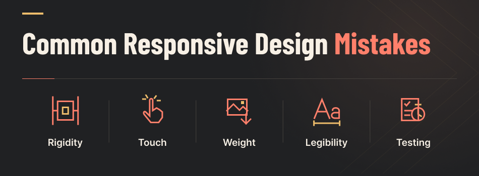
Common Responsive Design Mistakes
Even experienced teams can make mistakes when creating responsive interfaces.
Some common problems include:
Designing only for popular devices: New screen sizes and form factors continue to appear, so targeting only a few devices can leave gaps.
Using too many fixed dimensions: Fixed widths can cause overflow and unnecessary horizontal scrolling.
Ignoring mobile interaction: A design that works with a mouse may not work equally well with touch.
Using oversized images: Large assets can increase loading time and waste bandwidth on smaller devices.
Making text too small: Content should remain readable without forcing users to zoom.
Testing only at the end: Responsive issues are easier to fix when discovered during the design and development process.
A Simple Responsive UI/UX Checklist
Before launching a website or application, review these areas:
| Area | What to Check |
| Layout | Does the content adapt to different widths? |
| Navigation | Is navigation easy to use on mobile? |
| Typography | Is text readable at different sizes? |
| Images | Do images scale without overflowing? |
| Buttons | Are controls easy to tap? |
| Forms | Are forms simple and comfortable on mobile? |
| Accessibility | Can different users navigate the interface? |
| Orientation | Does the interface work in portrait and landscape? |
| Performance | Are images and resources optimized? |
| Testing | Has the design been tested across different devices? |
Final Thoughts
Responsive UI and UX design is about creating an experience that works well wherever users access it.
The goal is not to create a perfect version of a website for every possible screen size. Instead, designers and developers should build flexible layouts that adapt naturally as the available space changes.
Starting with a mobile first approach, using flexible layouts, choosing content based breakpoints, optimizing images, creating readable typography, designing accessible controls, and testing across different devices can help create a more reliable experience.
Responsive design is also an ongoing process. As new devices, browsers, interaction patterns, and user expectations change, websites and applications need to be reviewed and improved.
When responsive design is treated as part of the overall UI and UX process rather than an afterthought, businesses can create digital experiences that are easier to use, more accessible, and better prepared for different screens and devices.