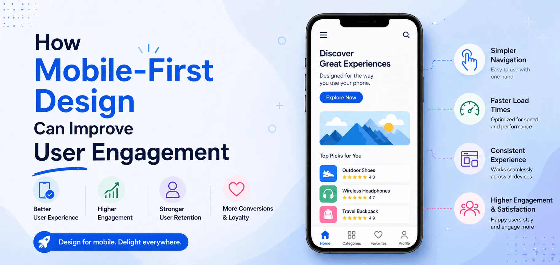
Mobile-first design is now one of the smartest strategies for creating websites that are easy to use, fast to load, and built for real user behavior.
If your website performs well on mobile, chances are it will create a better experience across all devices. And better experience means higher engagement, more conversions, and stronger brand trust.
Let’s understand how mobile-first design improves user engagement and why every modern business should adopt it.
What is Mobile-First Design?
Mobile-first design is a web design approach where designers and developers create the mobile version of a website first, then expand it for tablets and desktop screens.
Instead of shrinking a desktop website down to fit smaller screens, mobile-first starts with the essentials and builds upward.
This approach helps teams focus on:
- Clear navigation
- Fast loading speed
- Important content first
- Better usability
- Clean layouts
- Responsive design
Why Mobile-First Design Matters Today
Smartphones have become the primary device for browsing the internet, shopping online, reading content, and booking services.
Most users expect websites to load instantly and work smoothly on their phones. If a website feels slow, cluttered, or hard to navigate, users leave quickly.
That is why mobile-first design matters more than ever.
Benefits include:
- Better user experience
- Lower bounce rates
- Higher engagement time
- More leads and sales
- Better search engine rankings
- Stronger customer trust
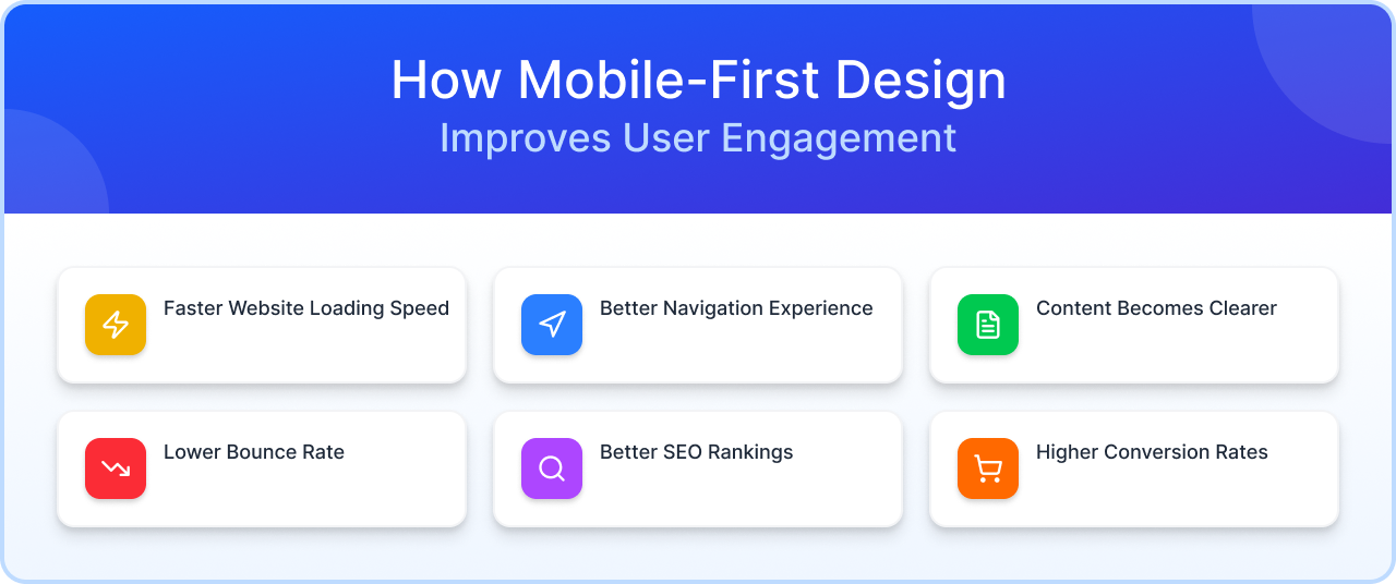
How Mobile-First Design Improves User Engagement
1. Faster Website Loading Speed
Mobile users expect speed. If your website takes too long to load, visitors often leave within seconds.
Mobile-first websites are usually lighter, cleaner, and optimized for performance. Faster loading pages keep users engaged and improve conversions.
Better Navigation Experience
On mobile devices, users navigate with their thumbs. If menus are confusing or buttons are too small, frustration increases.
Mobile-first design focuses on:
- Easy menus
- Clickable buttons
- Clear call-to-actions
- Smooth scrolling
This makes browsing simple and enjoyable.
Content Becomes Clearer
Small screens force designers to prioritize what matters most.
Instead of cluttered layouts, mobile-first websites highlight key information first:
- Main services
- Important headlines
- Contact buttons
- Product details
- Booking options
Users quickly find what they need.
Lower Bounce Rate
When visitors land on a mobile-friendly website that loads fast and feels easy to use, they stay longer.
That means:
- More page views
- Better interaction
- More time on site
- Stronger conversion opportunities
Better SEO Rankings
Google uses mobile-first indexing, meaning it primarily evaluates the mobile version of your website for ranking.
A mobile-optimized website can improve:
- Organic traffic
- Search visibility
- Core Web Vitals
- User satisfaction
Higher Conversion Rates
Whether users are filling a form, calling your business, or buying a product, mobile-first design removes friction.
Simple forms, fast checkout, and visible CTA buttons help turn visitors into customers.
Best Practices for Mobile-First Design
Keep Layouts Simple
Use clean sections, white space, and clear headings.
Use Thumb-Friendly Buttons
Buttons should be easy to tap without zooming.
Prioritize Speed
Compress images, reduce scripts, and improve page performance.
Show Important Content First
Users should immediately understand your offer.
Make it Fully Responsive
Your website should work perfectly on mobile, tablet, and desktop.
Test on Real Devices
Always test across multiple screen sizes.
Common Mobile Design Mistakes to Avoid
- Tiny text sizes
- Slow loading images
- Hard-to-click buttons
- Popups blocking content
- Too many menu options
- Poor spacing between elements
Why Businesses Need Mobile-First Websites in 2026
Your customers are already on mobile. If your business website is not built for them, you are losing traffic and opportunities.
A mobile-first website helps businesses:
- Build trust
- Increase inquiries
- Improve local SEO
- Boost eCommerce sales
- Stay ahead of competitors
Why Choose KIS Works for Mobile-First Web Design
At KIS Works, we create modern websites designed for mobile users first.
Our expertise includes:
- Mobile-first website development
- Responsive UI/UX design
- SEO optimized websites
- Faster loading websites
- Conversion focused landing pages
- Scalable business websites
We build websites that look great and perform even better.
Final Thoughts
Mobile-first design is no longer optional. It is essential for better engagement, stronger SEO, and higher conversions.
When users enjoy using your website on mobile, they are more likely to stay, trust your brand, and take action.
If you want better digital growth in 2026, start with mobile-first design.

