If you are a designer, web developer, or just a digital enthusiast! You must have heard of mobile-first design. If not, then must know how magic can happen on a palm-sized screen. It does not matter if you are a pro or just a beginner who just started to know the world of UI/UX, it is crucial to understand the ins and outs of mobile-first design. It is one of many keys that open the door to creating intuitive interfaces that users can’t help but fall in love with.
So, let’s first address the elephant in the room. What exactly is mobile-first design?
Well, as you have guessed by the name mobile-first design is creating the design for the mobile devices first and then scaling it up for larger screens. But if you get deeper you will get to know that it’s not just a design approach; it’s a mindset, a philosophy.
Why Mobile First?
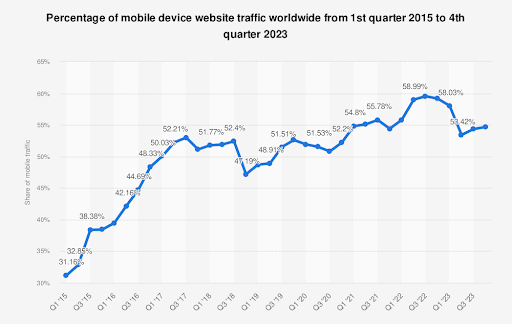
As we all know today’s digital world – MOBILE IS KING. Smartphones have everyone’s attention, which is the major reason for the rise in mobile traffic in recent years. Everyone has access to the websites on their hands. And with great mobile traffic comes great responsibility – to give users a mobile-friendly user experience that is smooth and delivers a killer experience.
This is where mobile-first design comes into play. By keeping the smallest screen in mind, designers start working to streamline navigation, prioritize content, and optimize every crucial element that will deliver a top-notch user experience. Also, scaling up is way easier than scaling down, so that’s another reason to adopt a mobile-first approach.
According to Statista, by the start of 2023, 58% of global traffic came from mobile devices as compared to 2015 where the traffic share of mobile devices is just 31.16%. This trend is expected to continue, with mobile devices projected to account for nearly 73% of internet users worldwide by 2025 (Source: Statista).

Moreover, mobile-first design is not only about focusing on creating a design best for mobile users; No, it is more about building a responsive interface. It is about creating a seamless experience for every device. And most importantly, it is an approach that ensures regardless of device screen size all users enjoy a consistent and instinctive experience.
So, as we all are living in a mobile-centric world, the mobile-first approach has become a necessity to stay relevant and meet the evolving needs of users across all devices.
Best Practices for Mobile First Design
Now that we know why we must use the mobile-first approach, let’s see what practices are the best for this approach. Below are some tried-and-tested techniques that will help take your your designing game to the next level:
- Keep it Simple, Silly (KISS): Mobile screens may be small, but that doesn’t mean your designs have to be. Embrace the beauty of simplicity by focusing on clean layouts, clear navigation, and minimalistic aesthetics.
- Thumb-Friendly Navigation: Remember, most users navigate mobile interfaces with their thumbs, so make sure your buttons, links, and menus are easily tappable – no microscopic text or cramped layouts are allowed.
- Optimize for Speed: Ain’t nobody got time for slow-loading pages. Optimize your images, minimize HTTP requests, and leverage caching to ensure lightning-fast performance – your users will thank you for it.
- Content is King: Don’t bury the good stuff under layers of fluff. Put your most important content front and center, and trim the fat wherever possible – ain’t nobody got time for long-winded intros or unnecessary filler.
- Responsive is Key: Mobile-first design isn’t just about designing for mobile – it’s about designing responsively, so your interfaces look and feel great on screens of all shapes and sizes. Embrace fluid layouts, flexible images, and media queries to ensure a seamless experience across devices.
- Test, Test, Test: Don’t just take my word for it – put your designs to the test with real users. Conduct usability tests, gather feedback, and iterate based on what you learn – it’s the only way to truly know if your designs hit the mark.
Wrapping It Up
And there you have it, folks – a crash course in mobile-first design, served up with a side of sass and a sprinkle of slang. Remember, designing for mobile ain’t rocket science – it’s about putting your users first, keeping it simple, and embracing the beauty of the small screen. So go forth, fellow designers, and may your interfaces be intuitive, your load times be speedy, and your users be delighted.


